Why Repeating a Small Motif Makes a Handmade Page Feel Connected
Repeating a small motif on a handmade collage page links scattered images and scraps, with enough variation to keep the composition lively and personal.
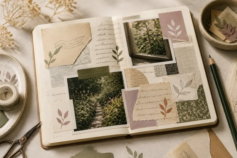
Why does one handmade collage page feel connected while another looks like a pile of unrelated scraps? Repeating a small motif gives the eye a familiar mark to follow, linking photographs, paper and handwritten notes without making them all match. The trick is to repeat the idea, not stamp out identical copies.
Scattered pieces have no visual route
A page can contain appealing fragments and still feel disconnected if each one asks for attention in a different way. A recurring shape—a crescent, leaf, small window or simple line—creates a visual route between them. The eye recognises the repeated mark and begins to read the separate areas as parts of one composition.
Choose a motif already suggested by the material. If a ticket has a rounded corner or a photograph includes a curved branch, a curved line may feel more at home than a crisp geometric star. You can draw the mark with a fine pen, cut it from coloured paper or use a small stamp.
Say you are arranging a pale envelope fragment, a dark garden photograph and a handwritten note. Imagine adding a small leaf shape near each piece, in a different colour drawn from that piece; the repeated silhouette gives the three areas a shared thread while the varied colours keep them distinct.
Try the motif in a few places before attaching anything permanently.
The repeated mark starts to look like a pattern
When every motif has the same size, colour and orientation, the page can feel mechanical. This usually happens because repetition is being treated as duplication. Keep one feature stable—the outline, for example—and vary another, such as scale, tilt, fill or placement.
A hand-cut paper circle can appear once as an outline, once as a solid shape and once as a partial arc tucked behind a photograph. They still read as related marks, but their different roles give the page movement. If the motif is already bold, keep the changes quiet; if it is faint, a stronger variation can help it remain visible.
Before adding more copies, pause and look at the page from a little distance. If the motif is the first thing you see everywhere, reduce its contrast or leave some areas without it.
The motif competes with photographs and handwriting
A motif that is too large or dark can pull attention away from the material it is meant to connect. The cause is often a mismatch in visual weight: a thick black mark can overwhelm a soft pencil note or a small printed image. Use a lighter pen, thinner paper, or a less saturated colour to bring the mark into the same conversation.
Placement matters as much as strength. A motif beside a face, a word or another focal detail may interrupt the viewer’s attention. Shift it towards an edge, let it overlap a quiet patch of paper, or use only part of the shape so it acts as a bridge rather than a new subject.
If a mark feels too prominent, test a softer version on a scrap before changing the page.
The repeated shapes feel pasted on
Motifs can look like decorations added after the composition is finished when they sit in empty spaces without relating to nearby pieces. Give each one a reason to be where it is: it might echo a curve in a photograph, sit beside a torn edge, or point towards a note. A small overlap can also help, as a shape slipping behind a paper layer appears more integrated than one floating nearby.
Keep the material’s practical limits in mind. A thick collage layer may not take a wet marker evenly, and delicate paper can buckle under excess glue. If the page is already built, use a dry medium such as coloured pencil or a small cut-paper mark rather than forcing a new material onto it.
How can a recurring motif stay lively?
How many times should a motif appear?
There is no fixed count that suits every page. Repeat it enough for the eye to recognise the connection, then stop before it becomes a border or a wallpaper effect; the size and spacing of the page matter more than a formula.
Should every motif use the same colour?
Not necessarily. A shared outline can tie together marks in different colours, while a single colour can connect shapes with varied outlines; choose which feature will remain consistent and let the rest respond to the nearby materials.
What if the page has no obvious shape to repeat?
Look for a small detail in the scraps, such as a curved corner, a short dash or a simple flower silhouette. If none feels natural, make a modest mark of your own and use it sparingly so it supports the page rather than competing with its contents.
Can handwriting be the recurring motif?
Yes. A small hand-drawn star, a repeated dash or a loose underline can connect sections without adding another paper shape; vary its placement and length so it reads as a visual cue, not a rigid rule.
The motif disappears or becomes too faint
A very pale mark can lose its connecting role against patterned paper, while a shape hidden beneath a photograph may no longer be visible at all. This often comes from choosing colour in isolation rather than judging it against the assembled page. Check the motif beside the actual scraps, not only on a clean work surface.
Try a darker shade, a slightly larger outline or a different material, but change one quality at a time. A coloured-pencil mark over a light wash, for instance, may stay legible without acquiring the hard edge of a thick felt-tip pen.
For a handmade page, repeating a small motif works best when it offers recognition without demanding attention. Keep the shape familiar, let its colour or position respond to each scrap, and leave room for some pieces to stand on their own. The page will feel connected because the marks belong to its materials, not because every space has been filled.